ShopDreamUp AI ArtDreamUp
Deviation Actions


![[New character] Iowyn](https://images-wixmp-ed30a86b8c4ca887773594c2.wixmp.com/f/d46cfbc9-24c1-4a09-829b-e2c438f6079f/d76g98u-6c9ac91f-f05c-40e4-a09e-a08a8a6771b9.png/v1/crop/w_184,h_184,x_27,y_0,scl_0.18145956607495,q_70,strp/_new_character__iowyn_by_twistyh_stock_d76g98u-92s-2x.jpg?token=eyJ0eXAiOiJKV1QiLCJhbGciOiJIUzI1NiJ9.eyJzdWIiOiJ1cm46YXBwOjdlMGQxODg5ODIyNjQzNzNhNWYwZDQxNWVhMGQyNmUwIiwiaXNzIjoidXJuOmFwcDo3ZTBkMTg4OTgyMjY0MzczYTVmMGQ0MTVlYTBkMjZlMCIsIm9iaiI6W1t7ImhlaWdodCI6Ijw9MTAxNCIsInBhdGgiOiJcL2ZcL2Q0NmNmYmM5LTI0YzEtNGEwOS04MjliLWUyYzQzOGY2MDc5ZlwvZDc2Zzk4dS02YzlhYzkxZi1mMDVjLTQwZTQtYTA5ZS1hMDhhOGE2NzcxYjkucG5nIiwid2lkdGgiOiI8PTE2MDAifV1dLCJhdWQiOlsidXJuOnNlcnZpY2U6aW1hZ2Uub3BlcmF0aW9ucyJdfQ.H4pHppvNbqefJhpZ1UzchlA8mO0E7xbE0RXReZTho7o)
![[New character] Iowyn](https://images-wixmp-ed30a86b8c4ca887773594c2.wixmp.com/f/d46cfbc9-24c1-4a09-829b-e2c438f6079f/d76g98u-6c9ac91f-f05c-40e4-a09e-a08a8a6771b9.png/v1/crop/w_92,h_92,x_13,y_0,scl_0.090729783037475,q_70,strp/_new_character__iowyn_by_twistyh_stock_d76g98u-92s.jpg?token=eyJ0eXAiOiJKV1QiLCJhbGciOiJIUzI1NiJ9.eyJzdWIiOiJ1cm46YXBwOjdlMGQxODg5ODIyNjQzNzNhNWYwZDQxNWVhMGQyNmUwIiwiaXNzIjoidXJuOmFwcDo3ZTBkMTg4OTgyMjY0MzczYTVmMGQ0MTVlYTBkMjZlMCIsIm9iaiI6W1t7ImhlaWdodCI6Ijw9MTAxNCIsInBhdGgiOiJcL2ZcL2Q0NmNmYmM5LTI0YzEtNGEwOS04MjliLWUyYzQzOGY2MDc5ZlwvZDc2Zzk4dS02YzlhYzkxZi1mMDVjLTQwZTQtYTA5ZS1hMDhhOGE2NzcxYjkucG5nIiwid2lkdGgiOiI8PTE2MDAifV1dLCJhdWQiOlsidXJuOnNlcnZpY2U6aW1hZ2Uub3BlcmF0aW9ucyJdfQ.H4pHppvNbqefJhpZ1UzchlA8mO0E7xbE0RXReZTho7o)


Description
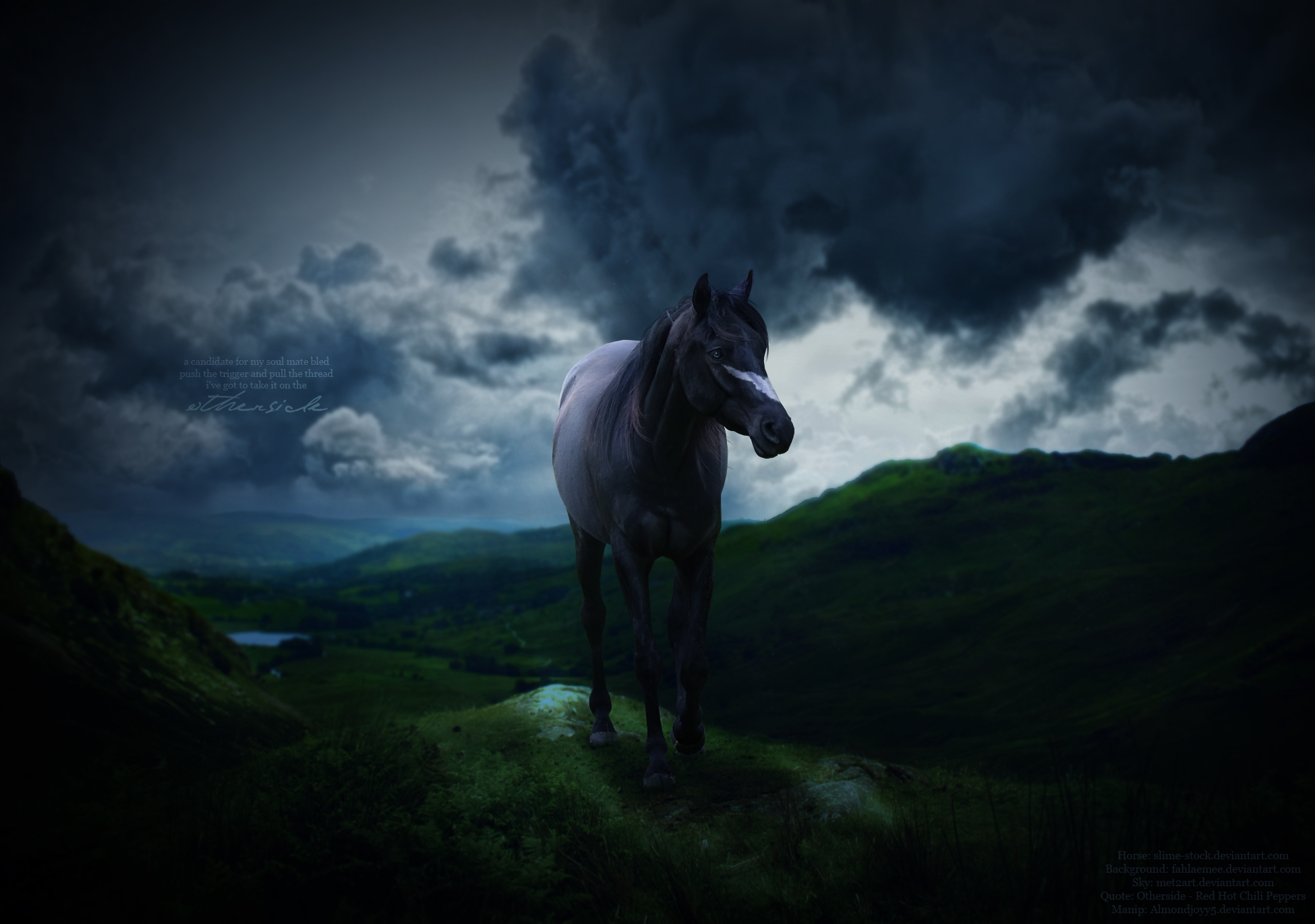
When I first "finished" this I thought it was soooo boring, so I went back and did some blurring, cropping, added a vignette and finally added the facial marking. I think they all contributed to the drama quite well. The quote is quite morbid and, well, I love it.
I know he has no tail but I was going for a natural look and the tail just wasn't fitting in.
Thank you to all the stock providers:
Horse: [link]
Background: [link]
Sky: [link]
I know he has no tail but I was going for a natural look and the tail just wasn't fitting in.
Thank you to all the stock providers:
Horse: [link]
Background: [link]
Sky: [link]
Image size
1950x1370px 763.69 KB
© 2012 - 2024 almondjoyy5
Comments8
Join the community to add your comment. Already a deviant? Log In
First off, I think the overall thought of the image was thought about quite nicely. The background fits together perfectly, the horse is a nice choice.
Now, to get down to the nit gritty.
I think your overall technique for the blending of backgrounds is quite good, both the sky and ground has a blue hint to that, so you paid attention to details very well. Although, I find your background blending still needs quite a bit of work, I suggest blurring the background with out it being selected (in case you had it selected) , also, using the smudge tool along the edge of the landscape where it meets the sky will help blend it better, giving it a more natural feeling and look. Also, I can see the edge of the cliff/edge that the horse is currently standing on, is blurred around the edges, which I can understand, but maybe draw some grass on that edge , to make it better/realistic would help it out immensely, also, you could take a nice sized brush, and draw some highlights on the grass.
Onto the horse, first off, the cutting is pretty good, along with the shadow, but I feel like you could of added some highlights to the mane of the horse, along with the eye, which is done quite nicely. Your muscle definition helps bring the horse out. Also, I feel like the grass/moss around the horses hooves could of been done a little better, or you could of actually taken it as short grass and drawn the hooves as if standing on a hard surface, such as cement. But overall, the grass and hooves are done nicely, there really isn't much to change about them. Oh, and maybe next time, leave the area where the horse is standing/walking un-blurred. Overall, this image is pretty good, vision, I couldn't really tell what is going on in the image /:, but I think that is just me, so don't worry there ^.^, technique is good, though some work/practice makes perfect, impact of the image was pretty good.